Back by popular demand.. The McSpicy returns to McDonald’s UAE with an Extra Spicy twist
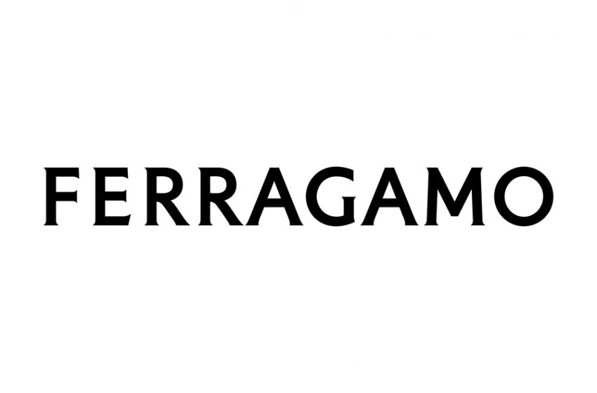
New Ferragamo logo

A new chapter is being written at Ferragamo: a conversation between the classic and the contemporary, based on both heritage and a clear vision of the now.
Acknowledging the importance of every single element to the whole, the journey of reinvention, the sharp sense of elegance and respecting the craft involved, starts at the foundation: the letters being used, the shape they take, the words they form.
The founder’s handwriting is translated into a serif font that is impactful, refined, affirmative as evidence, in taut tension between classicism and modernity.
Ferragamo commissioned Peter Saville, the renowned graphic designer, master of unexpected associations and an energetically streamlined style, to create the new logo for which he conceived a modernist take on a classic font, recalling the classical stone inscriptions that inspired Renaissance artists. Filtered through a resolutely reductionist lens, it is charged with a sense of history instead of being laden with the weight of history. All references are stripped down to an aura, suffusing an essence of the classic around the modernity of looking forward. A modernist and sensual intent is set in a logo that looks like it has always been there.
“The equity of Florence is in the culture of the company: that led me to the choice of a classic font. The vision is exacting and modern. Thereafter, the font is reduced and becomes modernist. Then there is the craft that is quintessentially Ferragamo, which is condensed in the idea of an inscription set in stone. Within this tension lies the new logotype and the complex balance it expresses” says Peter Saville.
“History is an immense treasure for a house that owns it. The new Ferragamo logotype contains and expands both history and the now. Far from being just a logo, it is a program, which will frame and direct the new chapter that is about to be written” says Marco Gobbetti.


